Key Facts and Figures
This page contains key facts and figures based on greenhouse gas emissions data reported to the Greenhouse Gas Reporting Program for 2015. The graphics serve as examples of the types of materials that can be generated using the Facility Level Information on Greenhouse Gases Tool (FLIGHT).
- EPA Greenhouse Gas Data Sets
- U.S. GHG Emissions (Inventory)
- GHGRP: Facility-Level Emissions
- Reported Emissions by Sector
- State GHG Emissions Map – Power Plants
- Petroleum & Natural Gas Systems
- Trends in Reported Emissions
- How to Learn More
EPA Greenhouse Gas Data Sets
EPA has two complementary programs that publish annual data on U.S. GHG emissions:
The Inventory of U.S. Greenhouse Gas Emissions and Sinks (Inventory)
- Comprehensive national estimates
- Drawn from national-level statistics
- Tracks annual GHG emissions from all sources in U.S. since 1990
- 2015 data will be available in the spring of 2017.
- http://epa.gov/climatechange/ghgemissions/usinventoryreport.html
The Greenhouse Gas Reporting Program (GHGRP)
- Facility-level data covering largest emitters (usually over 25,000 MTCO2e)
- More than 8,000 facilities report emissions, covering approximately 50% of total U.S. emissions
- Annual data available are available for 2010 onward
- Data allows emissions tracking by state or region
- 2015 data was published in October 2016.
- http://www.epa.gov/ghgreporting/
- Learn more about the differences between the Inventory and the GHGRP.
U.S. GHG Emissions (Inventory)
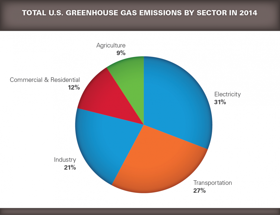
The pie chart below shows total U.S. emissions from the U.S. Greenhouse Gas Inventory for 2014 by sector. Total U.S. emissions in 2014 were 6,870 Million Metric Tons CO2e. The pie pieces colored in blue represent the sectors that contain facilities reporting direct emissions to the Greenhouse Gas Reporting Program. The vast majority of emissions from electricity generation and industry are covered.
 Generally, facilities that emit over 25,000 metric tons CO2e per year are required to report.
GHGRP: Facility-Level Emissions
The Greenhouse Gas Reporting Program is the only program that collects facility-level greenhouse gas data from major industrial sources across the United States. The GHGRP requires annual reporting of GHGs by 41 source categories, including power plants, oil and gas production and refining, iron and steel mills, and landfills.
For most industrial sectors, facilities that emit over 25,000 metric tons CO2e per year are required to report. In 2015, more than 8,000 facilities reported emissions to the GHGRP, representing approximately 50% of total U.S. greenhouse gas emissions.
This map shows the location and total reported emissions from each facility reporting direct emissions to the GHGRP.
Start mapping facilities using FLIGHT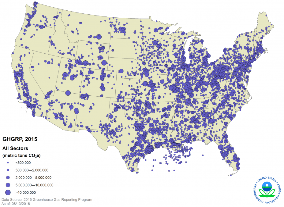
Reported Emissions by Sector
This image shows the major industrial sectors reporting direct emissions to the program, ranked by total sector emissions. The grey box to the right of each bar shows average emissions per facility for each sector. Power Plants are the largest source of greenhouse gas emissions in the United States, both in terms of total emissions and emissions per facility. The oil and gas industry is the second largest sector, in terms of total stationary-source emissions reported to the GHGRP. Refineries have the second highest emissions per facility, after power plants.
Observe total reported emissions by sector using FLIGHT.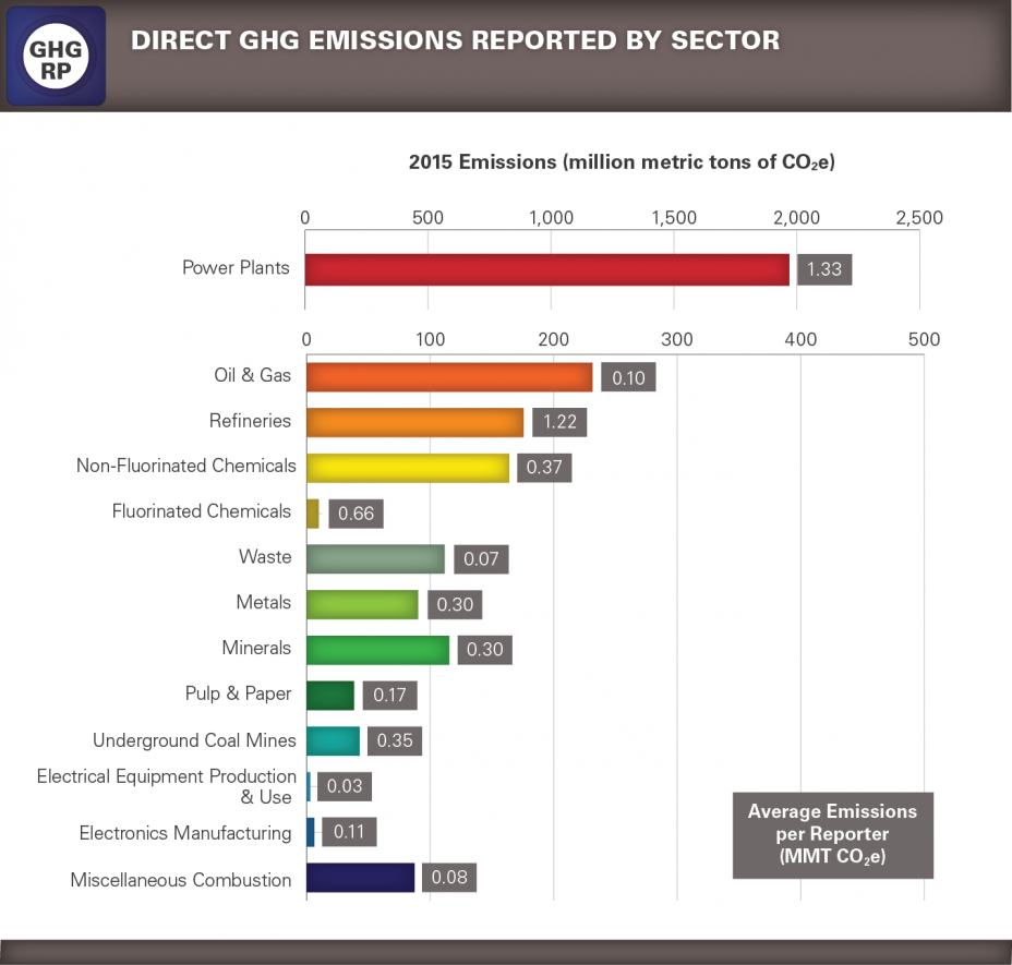
State GHG Emissions Map – Power Plants
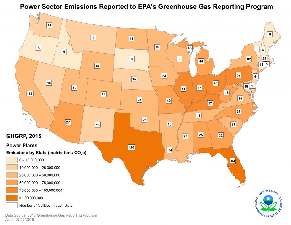
Power plants are the largest source of greenhouse gas pollution in the United States, accounting for roughly one-third of all domestic greenhouse gas emissions.
This map shows the total reported emissions from power plants by state in 2015 and the number of reporting power plants in each state.
Use FLIGHT to see total reported emissions from this sector by state.
Petroleum & Natural Gas Systems
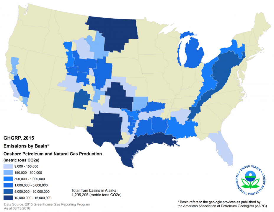
After the power plant sector, petroleum and natural gas systems were the second largest sector reporting greenhouse gas emissions to EPA. The map below shows the location and total reported emissions from onshore oil and gas production in each basin.1
This information can be found using FLIGHT by selecting Data Type = Onshore oil & gas production.
1 Basin refers to the geologic provinces as published by the American Association of Petroleum Geologists (AAPG).
Trends in Reported Emissions
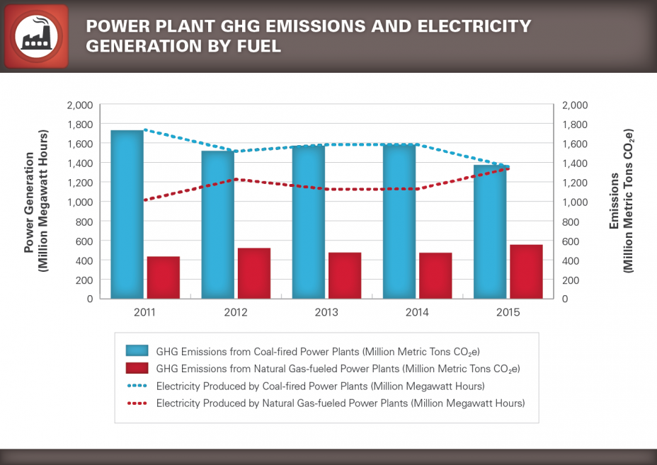
Using EPA's FLIGHT tool, users can see trends by facility, sector, or geographic region. Here we see trends for the power sector. From 2014 to 2015, emissions reported by power plants decreased by 6.2% and are now 11.3% below 2011 levels.
View a graph of trends from all reporting sectors in FLIGHT.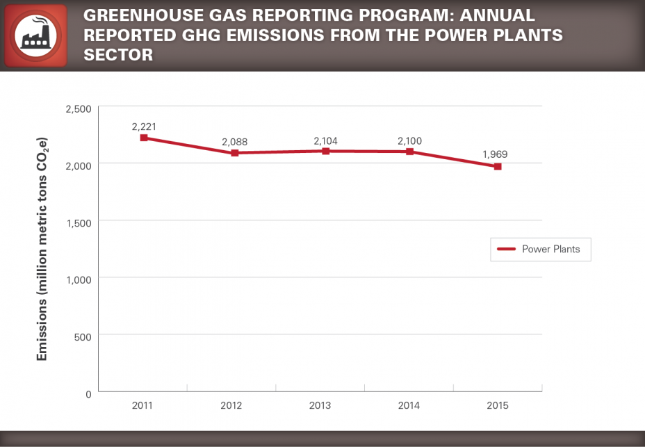
Several factors contributed to this reduction, including energy prices favoring the use of natural gas over coal, increased use of renewable energy sources and increased use of more efficient natural gas combined-cycle generators.1 Power plants produce less greenhouse gas emissions per unit electricity generated when natural gas is used as a fuel source than when coal is used. The chart below shows electricity generated2 and total reported GHG emissions3 from power plants by fossil-fuel type by year.
[1] Inventory of U.S. Greenhouse Gas Emissions and Sinks: 1990-2014. U.S. Environmental Protection Agency. February 22, 2016. EPA 430-R-16-002. Available at: http://www.epa.gov/climatechange/ghgemissions/usinventoryreport.html.
[2] U.S. Energy Information Administration, Electricity Data Browser: Net generation for all sectors annual, Available at: http://www.eia.gov/electricity/data/browser/#/topic/0?agg=2
[3] U.S. EPA Greenhouse Gas Reporting Program Dataset as of August 13, 2016. See http://www.epa.gov/ghgreporting/ghg-reporting-program-data-sets
How to Learn More
FLIGHT can be used to generate custom queries and produce maps, pie charts, trend lines, bar charts and lists of facilities. The images here are examples of the types of output.
Visit our Tutorials page for more information Exit.
Tutorials include:
- How do I find the largest emitter in my state?
- Where can I find emissions trend information?
- How can I compare GHG emissions from different industries?
- How do I find a facility in my town?

